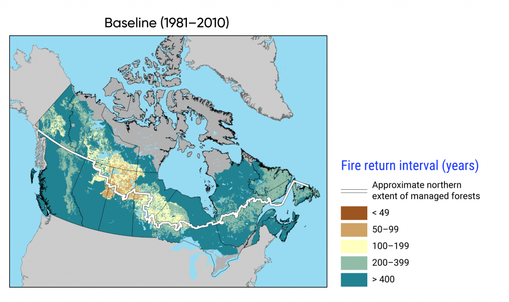
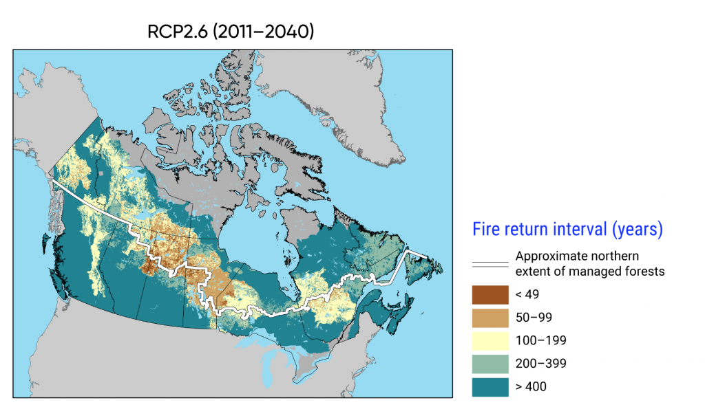
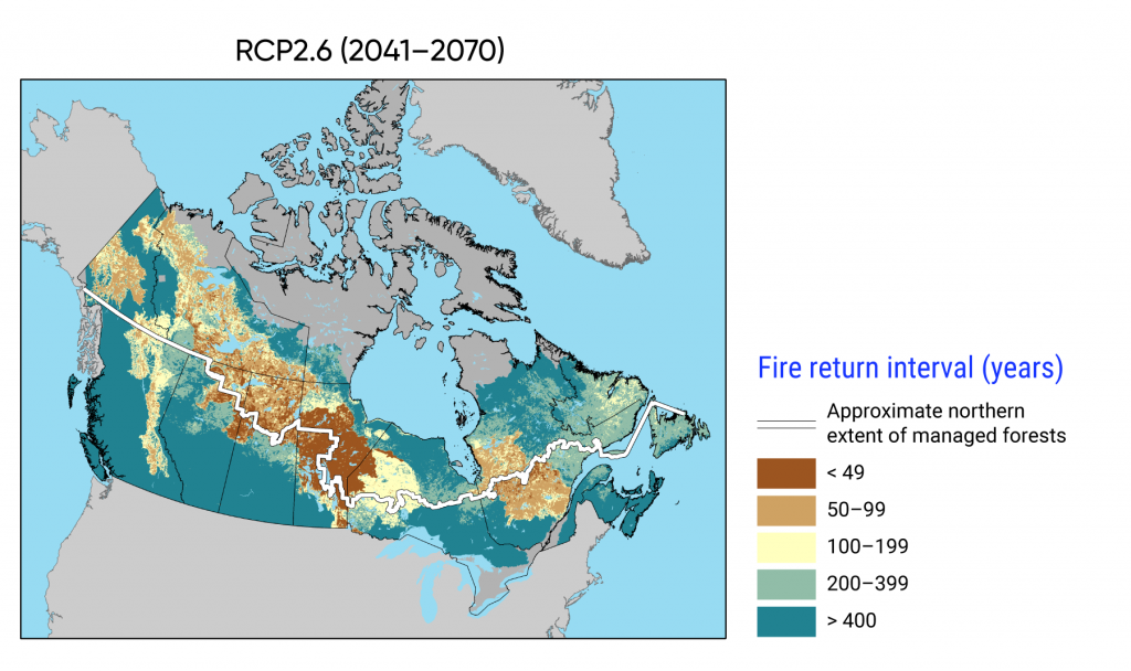
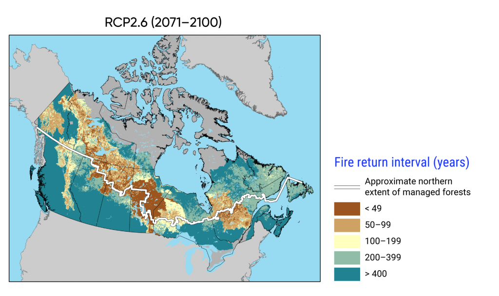
Figure 7.1-a
Interactive maps of baseline and projected fire likelihood in Canada, presented in terms of fire return interval (years), for a low greenhouse gas (GHG) emissions scenario (RCP2.6). Shorter fire return intervals (in brown and light brown) represent a higher fire likelihood, and longer cycles (in yellow, light green and dark green) represent a low fire likelihood. The maps show local fire likelihood (pixels represent a 250 m2 resolution) using the homogeneous fire regime zones of Boulanger et al. (2014) and display fire selectivity based on vegetation composition and stand age at the pixel level.
Source
Boulanger et al., 2014.