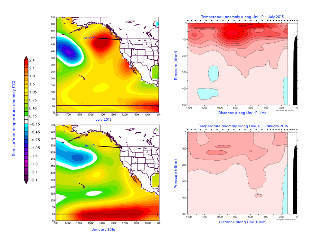
The left-hand panels show sea-surface temperature anomaly data (National Oceanic and Atmospheric Administration), including information from satellites, ships, and moored and drifting buoys. Temperature anomalies are the differences between the observed temperature and the long-term average temperature (both in °C) for a given location. The green, yellow and red colours represent above-average temperatures, whereas the blue and purple colours represent below-average temperatures. The right-hand panels show temperature anomalies by depth (in meters) along Line-P, as shown in the left-hand panels and starting near the southwest coast of Vancouver Island, BC, leading to the Ocean Station Papa (145°W, 50°N). The colours are demarcated by increments of 0.5°C.
Source
Adapted from Chandler et al., 2016.