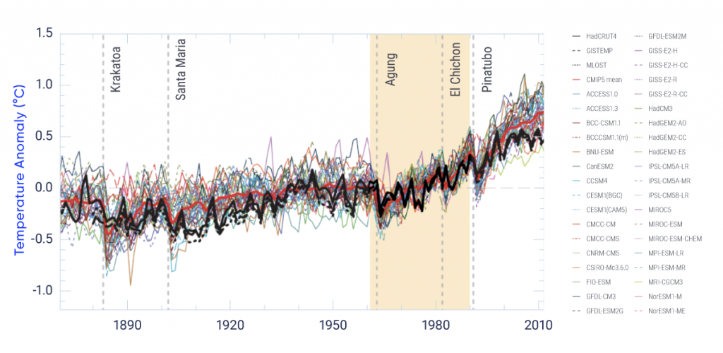
Global annual mean surface air temperature anomalies from 1850 to 2012 (anomalies are computed relative to the 1961–1990 average shown by yellow shading). The heavy black lines represent three different reconstructions of temperature based on observations. Each of the thin coloured lines represents a simulation from one of 36 climate models. The heavy red line indicates the multi-model average. The overall warming trend is evident in both observations and simulations, particularly since about 1960, and both show cooling following large volcanic eruptions (vertical dashed lines).
Source
Adapted from Flato et al. (2013), Figure 9.8.